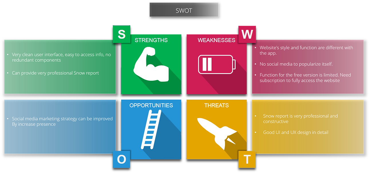
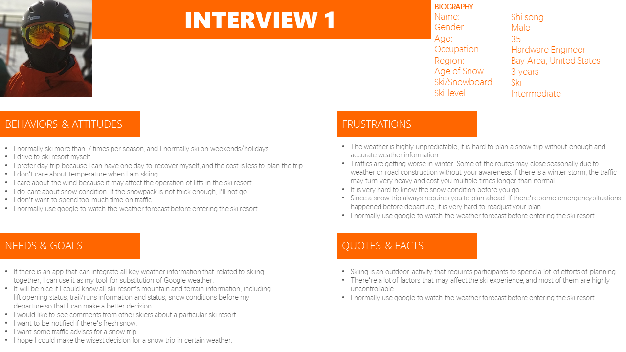
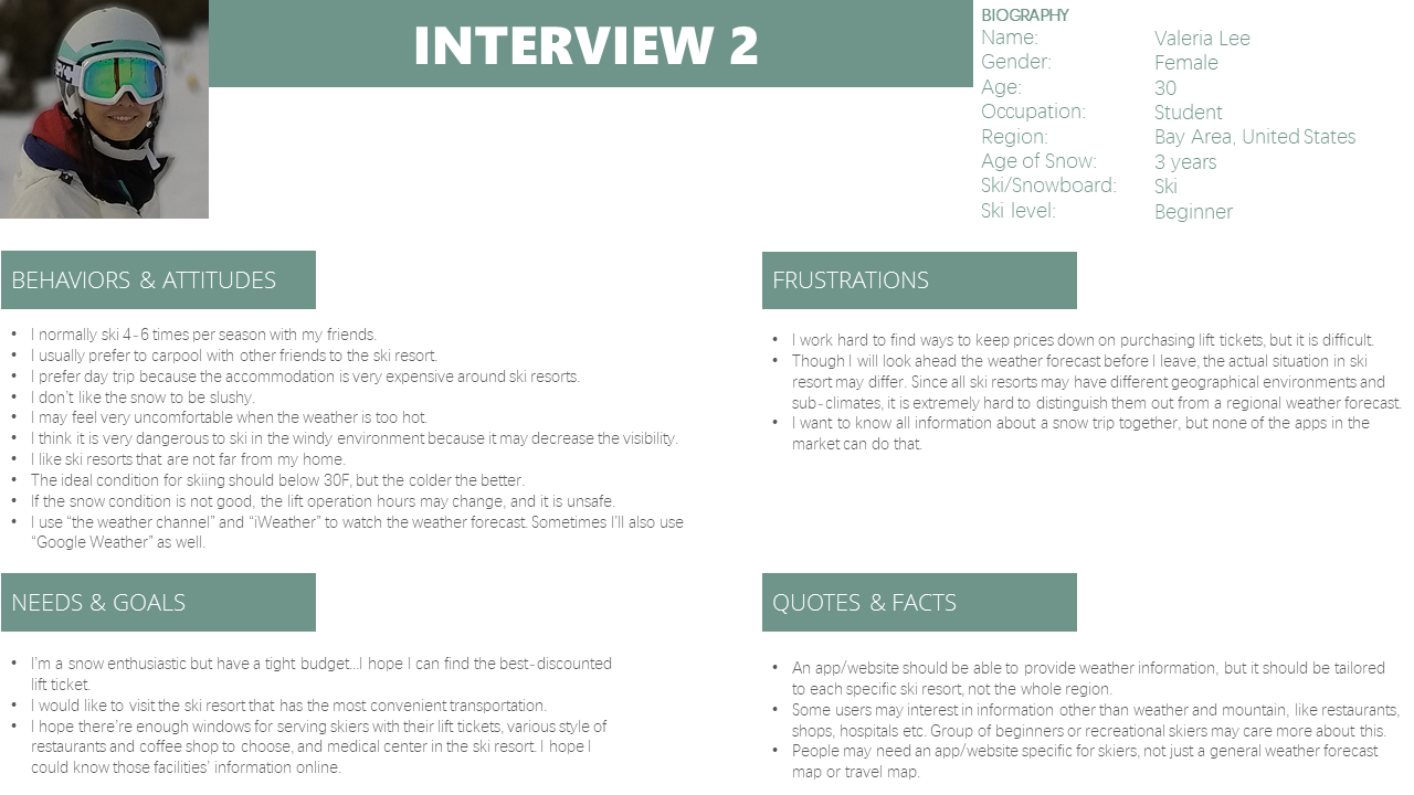
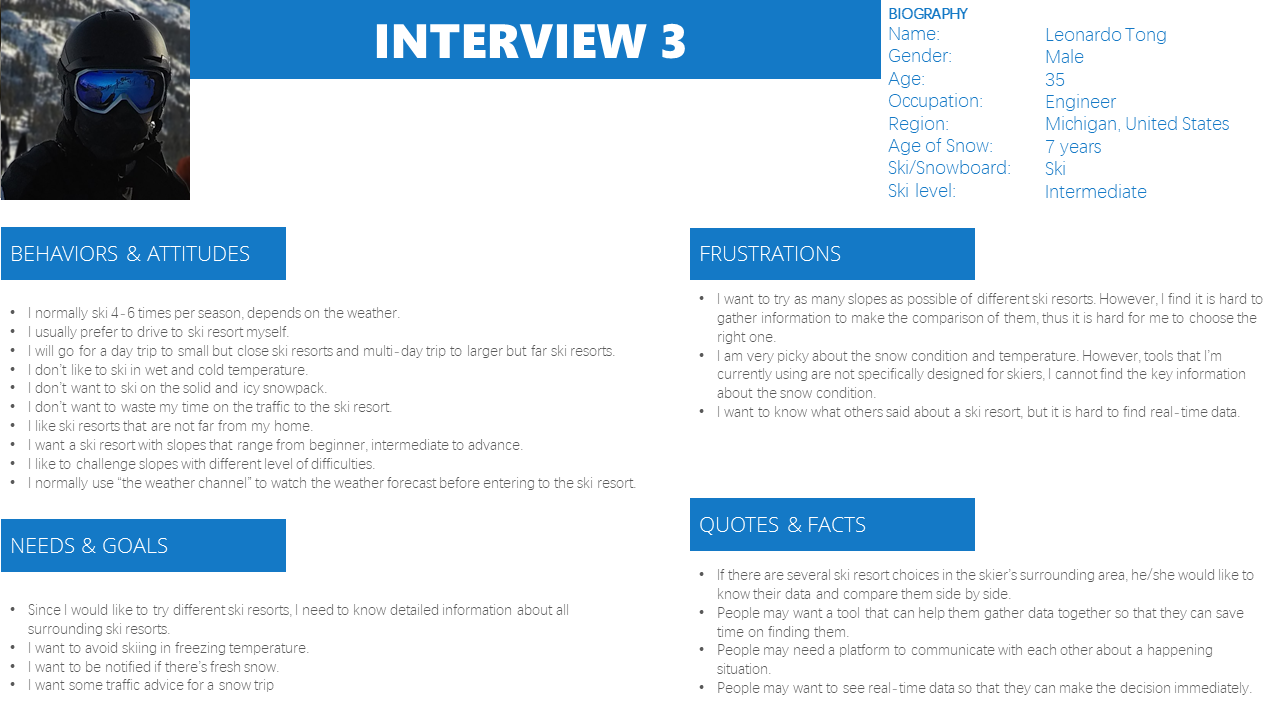
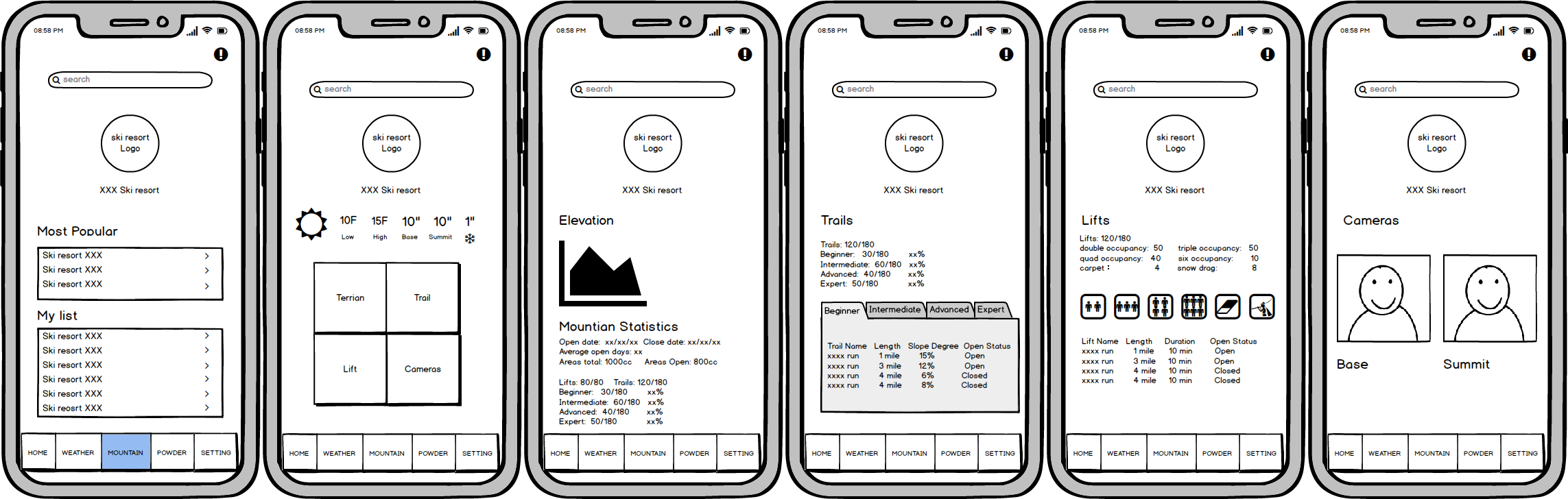
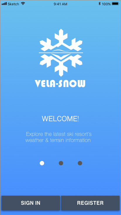
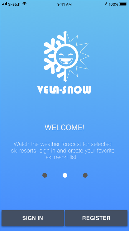
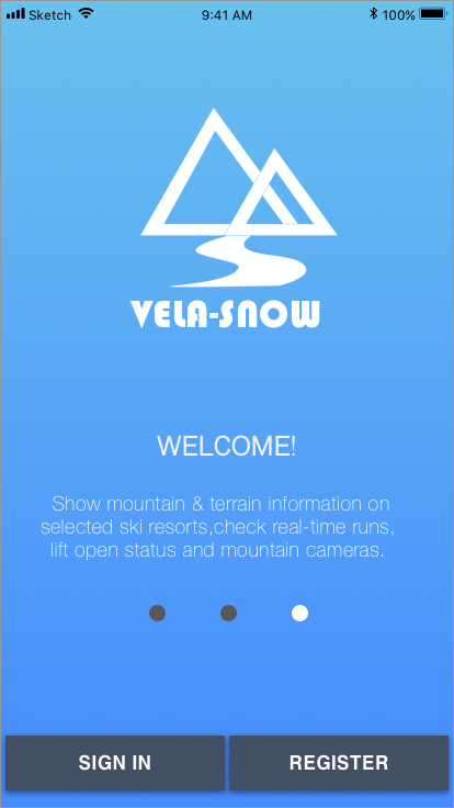
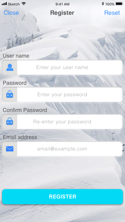
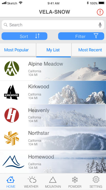
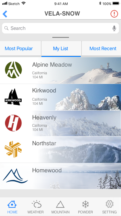
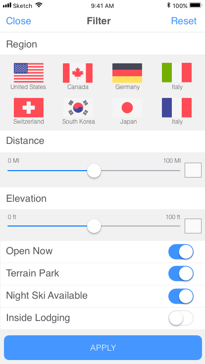
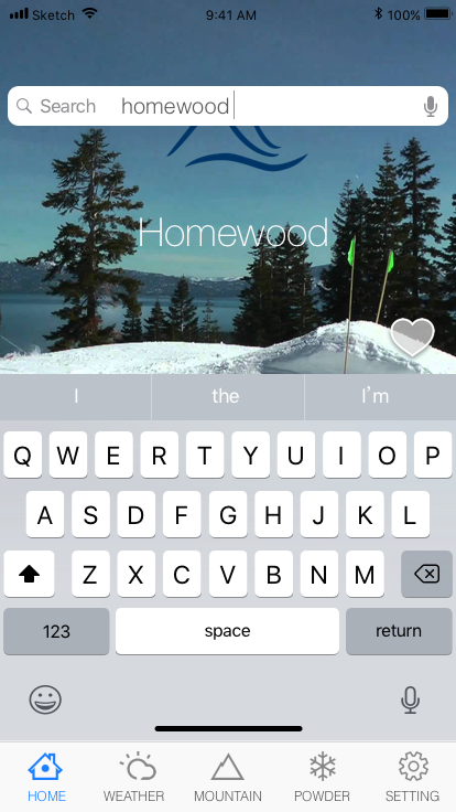
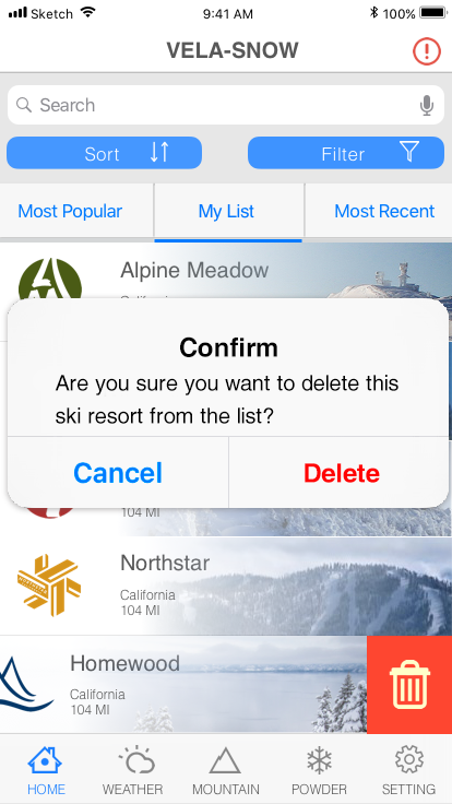
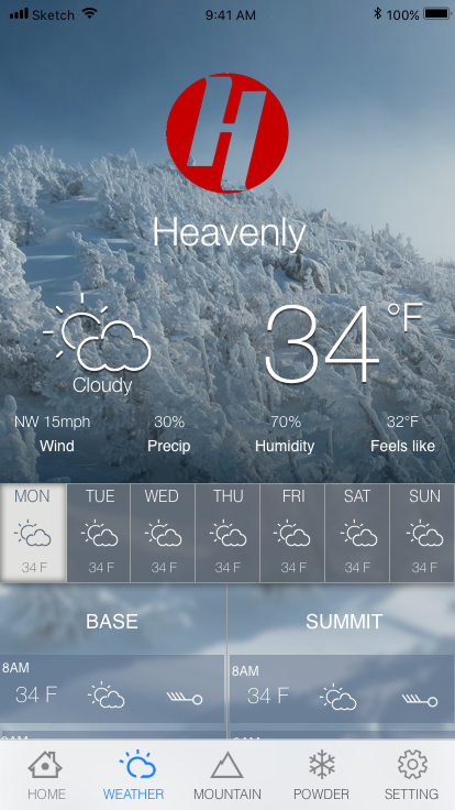
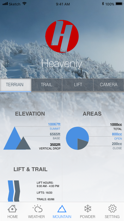
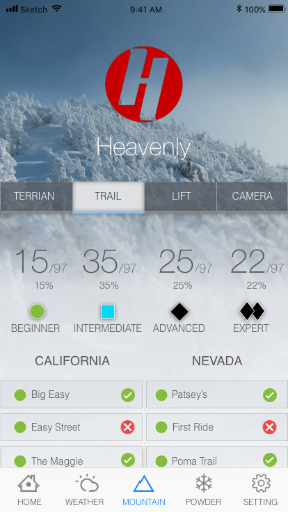
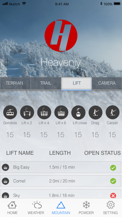
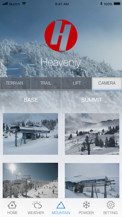
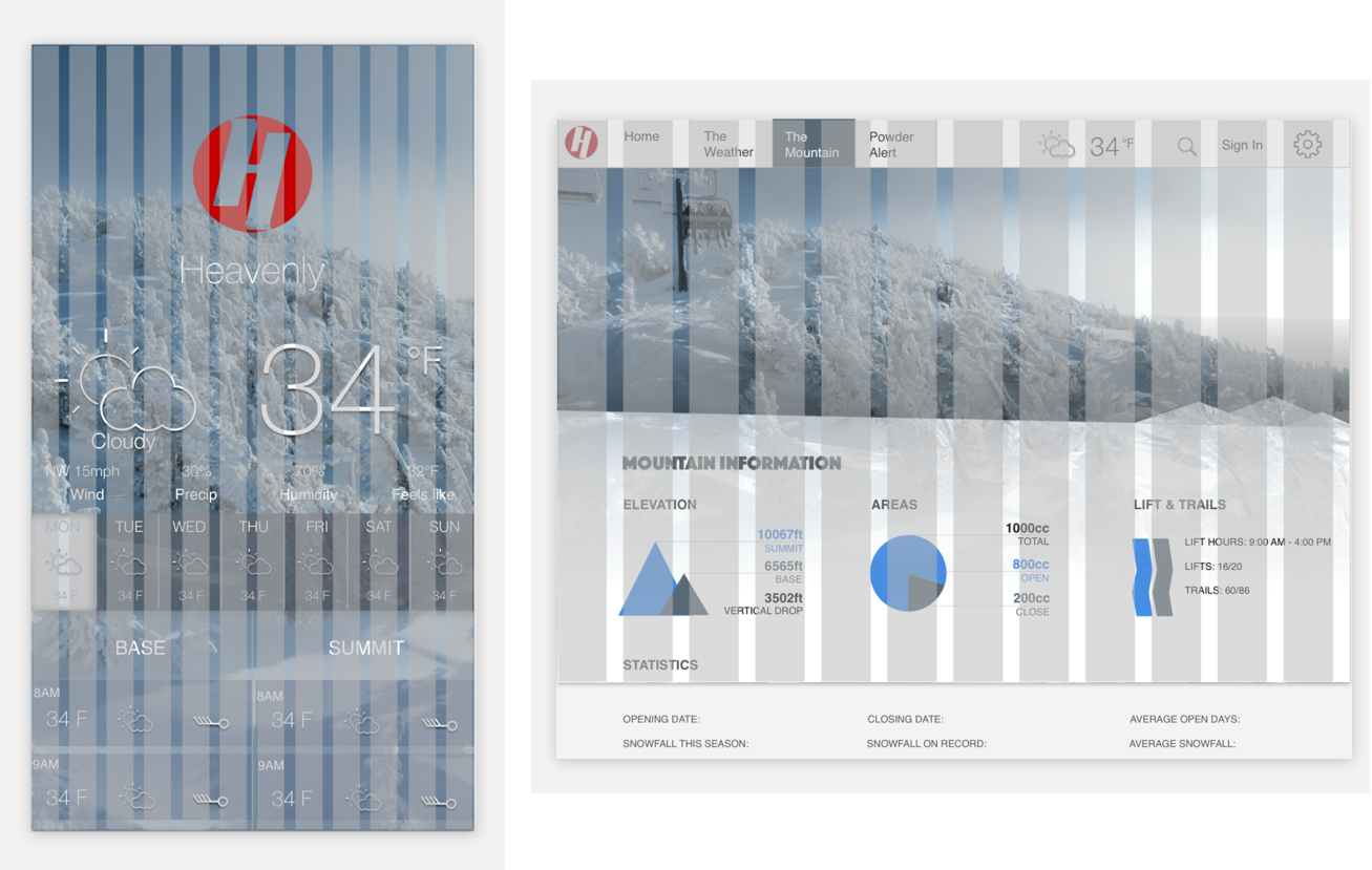
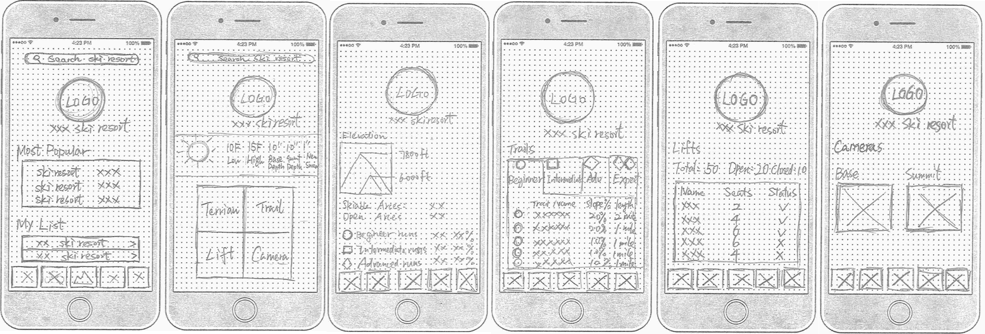
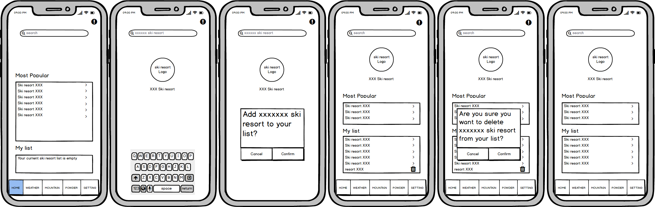
On the snow claims, they are the world's largest ski & snow reports provider. It can provide over 2,000 ski areas' current conditions globally. Their biggest advantage is to provide widely covered information all around the world. If you're living in Europe or North America then your region is almost covered by their data.
OpenSnow can let users access to the best snow forecasts, snow reports, and live webcams for over 2,000 mountain locations across the US, Canada, Japan, and Europe. Users may customize & save snow forecast and mountain reports and compare them on one screen. They also have a fantastic team to do local forecasters every day
Users need a way to find the most comprehensive ski information by their region including ski resort’s terrain, lift status, weather forecast, snow report, etc., because skiing is a sport that is highly influenced by external environment. We’ll know this to be true when we see activities keep on increasing, not only regarding app downloads, site visits and reviews, but also interactions between users, users and meteorologists.
Based on user interview and research, three user personas were created. Personas are vital to the success of a product because they truly reflect the needs of real-world users' needs and bringing them to the forefront of planning before the actual design started. User journey could further help us to address what a user thinks and feels when they come to different touch points in their journey. With the help of this, pain point that may affect the user flow could be quickly identified during the design process.
Similar to user journey, user flow tracks every point that from the start point to the end. However, user flow does not focus on users feeling or multiple layers of the solution. Also, the whole process may not be linear. The main goal of the user flow is to visualize the whole design process through the solution.
I used “OptimalSort” as my card sorting tool and conducted a card sorting test online. I created 19 cards and using open category to let participants have more flexibility and room to create their group. I had invited 8 participants, 5(62%) people completed my study, 3 abandoned. The average time spent by each participant is 5.78 min. From the similarity Matrix result, Most participants can group all weather-related card together (wind, humidity, temperature, etc.), and all settings related card (user profile, about, term of use, etc.). For account related cards, all participants can 100% group them together without any doubt.
It is an app that may use by snow zealots to monitor weather, trail status, snow conditions to their favorite ski resorts. Additionally, there is the option to post the snow condition on the slope to help inform other users of real conditions at their favorite locations.
The aim of this test is to test whether the functionality, usability, desirability, and accessibility of the app could meet auditors’ anticipation. Based on the test result, I may find the weakness of the design and modify it accordingly to maximum fulfill auditors’ anticipation in conjunction with the user experience.
The usability test will be conducted by both moderated in-person and moderated remote methods. Testers may use the laptop I offered to them or their own. In a moderated remote method, some IM software like Skype, WeChat may be used to conduct the test.
For a detailed view of the test script please visit:
https://drive.google.com/open?id=1SOiF1vre2CSa8V0szE53h6xDl6bqRcUORainbow Sheet and Test Affinity Map:
For the whole mockup please visit:
https://projects.invisionapp.com/share/AFJXA7KBSZP